What Is Brand Identity and Why Every Company Needs One

In the early stages of creating any company, its owner faces the question of how the external appearance of the organization should look in order to attract clients and stand out favorably against competitors. Everything that makes up this external appearance — logo, brand book, business cards, badges, envelopes, packaging, and special forms — is your unique and distinctive corporate identity.
A visual identity is a system of visual and verbal elements that makes a company recognizable across channels. It includes a logo, colors, typography, and rules for using them on a website, packaging, and other materials. Consistent use helps the brand look cohesive and distinct.
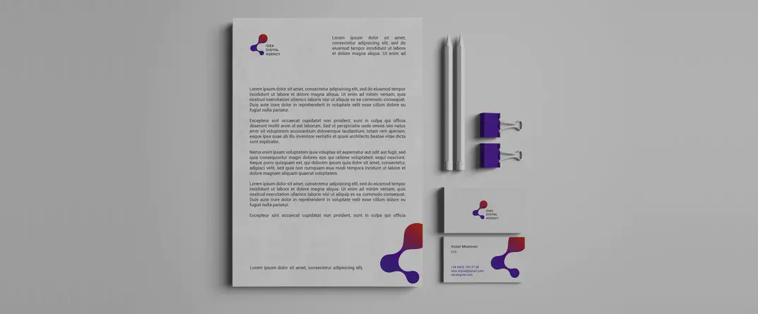
What is a visual identity, and why does a company need one?
It sets common design rules for every customer touchpoint, from the website to documents and packaging. This makes separate materials feel like parts of the same brand, even when different people create them.
Corporate identity is the main part of any company’s branding. The foundation of creating a corporate identity lies in selecting a suitable design for the products that your clients and partners interact with. It has been proven that a well-chosen corporate identity significantly influences whether a customer will choose your product or service over competitors. Therefore, this concept helps you compete in a vast market in any industry.
Why Do You Need a Corporate Identity?
Creating a unique corporate identity is quite an expensive process, but it is worth it. The main advantages of a high-quality corporate identity include:
- A quality corporate identity is the “face” of your image. Thanks to carefully chosen colors and fonts, you can increase not only your brand recognition but also the loyalty of your target audience, which ultimately leads to higher sales of your product or service;
- A distinctive corporate identity is the first factor that helps you stand out from the crowd of competitors. Consequently, the better the style, the better the “well-being” of the company;
- Corporate identity is necessary for all organizations. There is a common misconception that corporate identity is a trendy “luxury” needed only by large corporations, but this is not true;
- Thanks to corporate identity, a strong associative chain can be formed among consumers. For example, the mix of red and white colors is Coca-Cola, while the combination of yellow, white, and red is McDonald’s.
What are the main components of a visual identity?
The core components are the logo, color palette, typography, and rules for combining them. Depending on the company’s needs, the system may also define graphic treatments and tone of voice. The article below discusses color choices and the materials where the identity is applied.
First of all, the basis of any corporate identity is the color scheme. Usually, several colors are combined — two or three, rarely four. We recommend choosing not the colors you personally like as the owner, but those that will work best for promoting your business. Remember, the color red not only attracts attention but also strongly stimulates the human nervous system. It is also often associated with aggression. Yellow symbolizes a good mood and sincere pleasure. Green has long been a symbol of ecology, proper nutrition, and a healthy lifestyle. Blue is a symbol of calm and trust, which is why using it can significantly expand your brand’s fan base. In any case, each color has several meanings, and combining two shades can modify these meanings. To select the color scheme that perfectly fits your company, it is better to consult experienced marketers and designers.
Once you have chosen the ideal color palette, you need to proceed to the second stage, which is considered the most responsible and labor-intensive. At this stage, you need to decide how your logo, employee uniforms (if this is provided by the company’s charter), corporate block (brand name + logo), brand book, business cards, badges, favicon (website icon displayed in the browser), and promotional materials (bags, notebooks, pens) will look. Remember that all materials must be executed strictly in your corporate style.
At this stage, the company name is also chosen. Ideally, the name should embody your business. A good example of naming is the laundry detergent “Losk,” which gives clothes the desired cleanliness. This is an additional “hook” that attracts consumers.
Keep in mind that if you plan to enter the international market, you must consider how your name will be perceived in the countries where you will be represented. A vivid example of failed naming is the well-known company from the late 1990s specializing in selling premium drinking water called “Blue Water.” While the name did not raise suspicion in the United States and some European countries, in Ukraine and Russia it caused a strong negative association. It is easy to guess that after entering our markets, this company suffered huge losses.
When choosing your company name, you should:
- Avoid referencing small towns. For example, “DniproConfectioner” would mean nothing to people outside Dnipro;
- Avoid using slang. For example, the café “Yalynky-Palyntsy” is unlikely to ever enter the international market under that name;
- Avoid using personal names, such as the name of a loved one, grandmother, or aunt. It has been proven that promoting a hairdresser named “Olena” or “Natusya” requires much more money than similar establishments with other names;
- Pay attention to names that are well-known. A good naming example is the coffee shop chain “Pushkin”;
- Consider short prefixes like “Mr.,” “Mrs.,” “Dr.,” etc. They are well-perceived by consumers;
- Consider abbreviations, but remember they should not be hard to pronounce or unpleasant. For example, 3M (Minnesota Mining Machine) or ASICS (Anima Sana In Corpore Sano, meaning “A Healthy Mind in a Healthy Body”);
- Pay attention to humor and phonetic harmony, but beware of negative associations. For example, the target audience warmly accepted the sushi bar chain “Sushi Vesla” (“Sushi Oars”).
Main Requirements for Corporate Identity
Remember, corporate identity was created to help you stand out from the crowd. Therefore, all elements must:
- Be original. This point must be strictly followed. For example, if you create a logo very similar to that of a world-famous company, this will work against you by attracting consumers to the company from which you borrowed the logo, not to you;
- Be easy to remember. Graphic materials should combine eye-catching elements but also comply with legal restrictions and censorship. For example, a naked female body is undoubtedly a strong eye-catcher, but this image is beyond acceptable limits in most countries;
- Be easy to perceive. Do not use elements in your corporate identity that are hard for ordinary people to decode and identify. This negatively affects your brand recognition;
- Be informative. Try to embed a message in your corporate identity that communicates something about your company. This rule also applies to the company name and slogan.
Where are visual identity elements used, and why?
Identity elements appear on specific materials: websites, business cards, badges, stationery, packaging, and ads. Each format should retain recognizable colors, typography, and the logo while adapting them to its size and purpose. A brand guide helps teams apply these elements consistently.
Do you want your product to generate SEO traffic and bring in customers on its own?
Submit a request — the Idea Digital Agency team will carry out an audit of your website within 48 hours, draw up recommendations and discuss a future marketing strategy.
Frequently asked questions about visual identity
No. A logo is one element of an identity. A cohesive system also needs colors, typography, and rules for using them.
A visual identity is the system of brand elements, while a brand guide documents how to use them across different materials.
Start with the touchpoints customers see most often: the website, social media, advertising materials, documents, or packaging.
Yes. Even a few agreed rules for the logo, colors, and typography help a small team create materials consistently.


Ready to discuss your project?
Leave a request and we will contact you.